

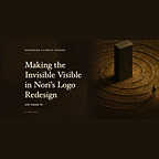

Episode 217 of the Reversing Climate Change podcast. You can listen on Spotify (subscribe there for ad-free), Apple Podcasts, or wherever else you listen. Paid subscribers get the ad-free version right here on the page.
The fact that CO2 is invisible makes it challenging to explain the idea of carbon removal to the general public. But one part of a designer’s job is to visually communicate abstract ideas in a way that audiences understand, and that’s how Amanda Yee approached the task of redesigning the Nori brand logo.
Amanda serves as Senior Product Designer here at Nori and author of the recent Medium article, ‘The Story Behind Nori’s New Logo.’ On this bonus episode of Reversing Climate Change, she joins Ross to explain what inspired the Nori logo redesign, sharing the practical concerns she had with the original logo and describing the difference between good UX design and good visual design.
Amanda walks us through her approach to creating the new logo, discussing why she chose the orange and blue color palette and how the simplified design lends itself to both our climate and crypto communities. Listen in for Amanda’s insight on the opportunities for designers in the climate space and learn how the new Nori logo visually communicates the invisible idea of carbon removal.
Resources
Amanda’s Medium Piece on the Story Behind Nori’s New Logo
Michael Legget on Reversing Climate Change EP042
The Design of Everyday Things by Don Norman
More from the show
Ad-free episodes and other benefits come with a paid subscription.
Carbon Removal Newsroom, the news show that ran alongside this one, is over. Its episodes are still up, on the feed Climate Workers Anonymous now uses.
Carbon Removal Memes is still goofing around.
The books that come up on this show are collected on my Bookshop shelf.
🎧 Apple Podcasts · Spotify · YouTube
Paid subscribers get this episode ad-free. The ads in the free feed are inserted by Spotify when you press play. They are not in the file I make.
Full Transcript
Ross Kenyon: [unclear] Listening to the Reversing Climate Change podcast by the team at Nori, the carbon removal marketplace, is a show about the innovators and entrepreneurs developing solutions to climate change.
Hello and welcome to the Reversing Climate Change podcast with Nori. I'm Ross Kenyon. I'm Nori's creative editor. [unclear] senior product designer at Nori and designer of Nori's new logo. Hey Amanda.
Amanda Yee: Hey, what's [unclear].
Ross Kenyon: Nothing too much. Excited to talk about this logo you designed, which is a nice feather in your cap. We're all super pleased with it. I bet you're riding a nice high of that right now.
Amanda Yee: Yeah, definitely. I didn't expect to put that feather in my cap either. I feel like that's something that oftentimes companies look outside of the company to do. They hire an agency for something.
Ross Kenyon: That's pretty common.
Amanda Yee: Yeah, definitely.
Ross Kenyon: How did that process even happen?
Amanda Yee: Well, so we were preparing for our token launch and I noticed that we didn't have like a symbol in our existing brand style guide that would work for it. And that's kind of what got the ball rolling and just realizing that, oh, we need to start at the root, which is our brand. And that's what kicked it off.
Ross Kenyon: Every time we've done an episode about this, which has been, I think there's been at least one, we had our former head of product, Michael Leggett, back in the day and we talked about design and they made me read The Design of Everyday Things, which you were telling me that you've read before, which is a great book. If you haven't read it, it gave permission that when something failed to interact with something successfully, I no longer blame myself or blame myself nearly as much. I've given myself permission to blame the designer.
Amanda Yee: Yep.
Ross Kenyon: Right?
Amanda Yee: That, I totally agree. Good design should go unnoticed. So those like push and pull doors, which is a big...
Ross Kenyon: I feel like it's a whole chapter, multiple chapters in that book. That's a great example. People should just know to push or just know to pull.
Amanda Yee: Yeah.
Ross Kenyon: If you've ever done a bad job at opening a door, it's not your fault. You can let it go.
Amanda Yee: Bad design.
Ross Kenyon: So I think about that all the time actually. It's nice to let that one go. One thing you said though caught my ear, which is that design is supposed to be invisible, and I think it's something that people take for granted. They only ever notice it if it's bad or if it's exceptional.
Amanda Yee: Yeah, so I would say that there's more nuance to that statement that I initially gave. So for user experience design, I believe that that should just be totally seamless. The person shouldn't even realize that they're struggling to do something because it has been so well designed.
Ross Kenyon: This is like working through a website or an app or something?
Amanda Yee: Yeah, exactly. And then working with visual design, that should be really nice and that should be noticed and... it should create an emotion.
Ross Kenyon: You want to notice that one. Visual design, you want some sort of reaction. You want it just to be seamless. Two very extreme examples right there. I have an example I thought of. Do you know Cy Twombly?
Amanda Yee: No.
Ross Kenyon: [unclear] way cooler than me. They always made me feel like Hank Hill. Dressing kind of square, relatively. They would be dressed like something like David Byrne from the Talking Heads might wear, like an oversized suit that's bright orange or something. I'm just not this cool. Anyway, Cy Twombly had these like enormous canvases that would stretch across the entire wall and would have like a little squiggle in the bottom left and then like a bunch of crayons on it. Really pissed me off. I'm like so angry I paid $30. Is that good visual design? It evoked an annoying emotion in me.
Amanda Yee: Yeah, well, so there's also a difference between design and art, and what you were just talking about was, I assume, art.
Ross Kenyon: You assume, but who can say? I guess it's in the eye of the beholder. So is that an appropriate application of this idea or is it different somehow? Like it provoked me. Is that an example of if you design something for Nori that provoked a negative emotion, would that be an example of successful design?
Amanda Yee: It depends if I wanted you to feel something negatively about it.
Ross Kenyon: Hmmm.
Amanda Yee: Like if you were showing the world being destroyed, you might be trying to evoke that negative emotion. Yeah, although I don't believe at Nori we would want someone to feel negatively about it, we would want to turn it into something of hope and that we can do something about it.
Ross Kenyon: Yeah, so you think even starting from some place kind of negative and showing that with product or with this company, some horrible outcome might be averted. You're thinking that initial negativity might overwhelm the positive still in the mind.
Amanda Yee: Yeah. Yeah. So one example, this is a tangent. I was watching Seaspiracy. Have you seen that documentary?
Ross Kenyon: Yeah.
Amanda Yee: It was very like shock and awe. It made me really sad actually. It made me so sad. And I think that was by design, leverage that sadness and show that type of action happening.
Ross Kenyon: It also ends with [unclear] of an optimistic note, but a lot of it I think remembers like write your congressperson or here's the things that you can do, stop eating fish or these kinds of fish. But the emotion that resonates with me still to this day is probably that shock, negativity, more than hope. But maybe that negative emotion can still be useful in some cases, maybe not. Sounds like maybe at least for Nori specifically you think that's probably not the emotion that we're driving toward.
Amanda Yee: I don't think so. No. Although I don't know. You also work at Nori. What do you think?
Ross Kenyon: I think in general, we have always started from a position of optimism. I think if we sort of revealed in our choices too, if we weren't optimistic, why would you bother working at a company like this? Make your own stockpile.
I love this conversation every time it comes up because, well, when we were doing the logo design and you were asking for feedback, the kinds of things you notice make me laugh because I love watching designers work and the things that you notice and think about are so, yeah, we take them for granted, especially if you don't have that kind of training in an eye. I think people listening might not realize how much opportunity there is for people who do have a design background, who aren't just hardcore, hard science people to get involved in this space. I think a lot of attention goes to, you know, people are figuring out new ways to use minerals, [unclear] in certain ways, reacting with air to pull carbon dioxide out or to pump carbon dioxide underground. Designing beautiful user experiences fundamentally different. What do you think those people might be missing?
Amanda Yee: So I also thought something similar as well when I was first trying to transition into this, into the climate space. So I came from a very traditional B2B, SaaS, sales and marketing company, looking for a job in climate. I was wondering how could I as a designer actually [unclear] something with my time that could help reverse climate change. And I was thinking like, oh, I have to become a scientist, I have to become an engineer, I got to go back to school. And I believe people think that because that's what surfaced in the news and the media, it's the actual actions of reversing climate change. And I think it's because it's also, carbon dioxide is invisible, right? So it's hard to sort of picture yourself fixing it and fixing those problems around you.
Ross Kenyon: People always talk about the difficulty of telling a climate change story because it is abstract, dilute in the atmosphere to 400 something parts per million. Small, it's not visible. I've heard Paul often say that if carbon dioxide were visible somehow, more might've been done about it already. Think about visible air pollution or smog in LA, something like that. Immediately offensive.
Amanda Yee: Yeah, you notice it immediately.
Ross Kenyon: [unclear] reasons why Nori has been so interested in creative endeavors and maybe design is just an extension of that. So that's interesting. You see your job as telling a story. Is that kind of what you're saying?
Amanda Yee: Yeah, and really... one of the superpowers of designers is that they're great at communication in terms of how they can visually communicate ideas that are invisible, have them understood by other people and different types of audiences.
Ross Kenyon: Do you have a, it's okay if you don't, but do you have an example at hand of how you've been able to work through that process, taking something that's functionally invisible, rendering it not so?
Amanda Yee: So I think one idea that comes to mind is on our website, we didn't really do a good job showing people what they're getting and we still don't do a super great job of that. There's still room for improvement there, but we've taken steps to bring to the forefront the farmers that you're actually buying carbon removals from and helping tell that story. So showing their faces and showing like these are the people, this is the actual land you're buying carbon removals from and these are the regenerative agriculture practices that you're helping.
Ross Kenyon: People even ask us for more of that sometimes too. I was just talking to the demand team about that. People want to know, they want to know who's this farmer, they want to be linked to their Twitter, they want to have real-time access to this person, they want exactly which field this occurred on. People want that kind of interaction and how many design choices go into making that a pleasing experience.
Amanda Yee: So many. Countless. So many design choices. So many choices in general. Like what do people want to know? Who wants to know this? What's the best way to share this type of information? What do they need to know at this point in time?
Ross Kenyon: There's a lot more questions. This is so much of my life too, because we produce a huge number of assets. Textual, visual, audio. Audio, that's not right.
Amanda Yee: This is audio.
Ross Kenyon: Audio, audio. Oh, audio. I just made that word up, audio. I guess aural, but like A-U-R-A-L. Like of the ear, whatever. Was I even saying something important? It's hard to say now.
But we produce so much content. And if you look on the website, one of these, it's often called information architecture, just how one navigates through this site, how one finds one's way to different types of content that is being offered. And we've done it almost by persona. So like if you're coming at it from a B2B angle, it's this. If you like the crypto angle, it's this. If you're a farmer or you're coming from supply, go look over here, but there's more pages than are listed. They aren't always nested in the correct way. There isn't always like a natural flow to working one's way through it. We're at this design impasse, at least with creative, I'm trying to figure out what good is additional content. If the design process of working through this is not intuitive, there's not a controlled release of information. If it's just like, here's 50 walls of text that you can randomly find yourself toward with no call to action and no. I'm willing to say that's probably a failure of design leadership on my end. How do you even organize that information in a positive way? Will you save me and do my job for me, Amanda? Is this actually your job? Can I blame you?
Amanda Yee: Yeah, this is actually my job. You've noticed bad design. See?
Ross Kenyon: But is even something like a website layout, is that also just part of what you're thinking about and trying to create that pleasing experience?
Amanda Yee: Yeah, definitely. How someone navigates to the website when they land on a page? What? What type of information are they looking for? Why did they come here? And how can we surface that to the top?
Ross Kenyon: Yeah, that's pretty tricky. I've also heard people say, and I mostly buy this, that when people buy anything, there are certainly caveats to this, but when people buy anything, they're buying a feeling or like an experience of buying that thing more than the thing itself. And I think Nori is a good example of this because what exactly are they buying? A barcode, even like offering a certificate to buyers is relatively new, right? That was like a big thing that we added, trying to create in real physical meat space, you're used to you put cash on the barrel head, you get some sort of physical object back. How do you replicate that experience when it actually isn't truly necessary?
Amanda Yee: Yeah, so we're trying to figure that out right now actually in finding, so demand team Alexsandra and Gia are talking with our current customers and we're realizing the importance of having that concrete certificate is something that represents, again, the invisible that they're buying. So it's really helpful to bridge that.
Ross Kenyon: Yeah, this is part of your theme of making the invisible visible.
Amanda Yee: Yeah, I didn't know I had a theme until this show.
Ross Kenyon: We made one up. Welcome to podcasting. What do you know which of those things are important or not? Is it something that you just have deep in your artist's soul or is this a customer feedback kind of thing? Both?
Amanda Yee: I think it's both. Yeah. Putting myself in the shoes of someone who's buying carbon removals. I don't know what I'm buying. What is it? I can't see it. Right? And then from a business point of view, we're talking to our customers and we're hearing them say that this physical aspect is really important.
Ross Kenyon: That makes sense. Let's talk about the logo. That logo. How old is that?
Amanda Yee: I think it might be...
Ross Kenyon: We worked with an agency back in the day. I think super early in Nori's origins. I think we actually had that built. We used to be called Geoagora. Did you know that?
Amanda Yee: No.
Ross Kenyon: Like the mixture of geo plus agora, like a marketplace or like an area where people exchange ideas and goods.
Amanda Yee: Oh, wow.
Ross Kenyon: And geo. It's a terrible name, right?
Amanda Yee: Yeah.
Ross Kenyon: I like Nori. I'm a lot more.
Amanda Yee: Yeah.
Ross Kenyon: Nori, you know, four letters has more of like a, imagistic in a way, where Geoagora is like telling you what it is.
Amanda Yee: Yeah, I also don't think a lot of people would know what Geoagora is, either.
Ross Kenyon: It's an earth agora, obviously. You feel.
Amanda Yee: Yeah.
Ross Kenyon: I'm glad that was our handle for the first hackathon that we did. I think if you listen to the first podcast that we produced ever for that hackathon, we also called ourselves Geoagora in that too. I'm glad that one didn't make it down the mountain. Every change. But the old one, well, if you look in the show notes, you'll be able to see the old logo, the new one. And then Amanda wrote up a really great Medium post called The Story Behind Nori's New Logo that explains some of the thinking behind why this needed to be updated at all. I don't know. Why don't we just work through this? What went into making this new logo? I guess you started to tell us, but do it.
Amanda Yee: A lot went into making this new logo. So like I mentioned at the very beginning, it all started with preparing for our upcoming Nori token launch and realizing that the logo that we had...
Ross Kenyon: Today?
Amanda Yee: The beautiful and [unclear] funky Nori logo with the all caps Nori and the landscape, that wouldn't work for what we needed to grow into, which is our Nori token and really emphasizing the crypto aspect of Nori. So it's got the ball rolling and again, it's always important to start with why and try to figure out like what problems are we trying to solve? So we identified the problem and then I realized, okay, what other, if we are going down this path, how can we make sure that this will set us up for success in the future? What other problems is our new logo causing that, or is our old logo causing that we should try to fix with our new logo? So I guess I did a little tear down of our logo to figure out what areas of improvement there were.
Ross Kenyon: Some of the concerns that I see you've raised here are practical. For some uses, the logo was illegible, elegant enough. Some of them are more for where it's going. Some of the reasons are even somewhat more abstract than that. It's a mix of, right?
Amanda Yee: Mm-hmm.
Ross Kenyon: What were some of these practical concerns?
Amanda Yee: So practical concerns were that as we've gotten more partnerships, we've seen our logo being used in many, many different ways. And our logo hasn't been able to [unclear] different types of spaces. Specifically, it looks pretty bad at small sizes because you couldn't see what was happening in the little mountain.
Ross Kenyon: You could definitely see the Nori, but everything else is pretty blurry. What even is it? I have it pulled up real close. And if I had fresh eyes, it just looks abstract to me. It's a mountain in a river is what I would guess.
Amanda Yee: Would you actually guess that? You would?
Ross Kenyon: Yeah.
Amanda Yee: Okay. I guess it's on my laptop too.
Ross Kenyon: Oh, it is.
Amanda Yee: I would see it. That's easier to see though.
Ross Kenyon: When I'm looking at this on the screen though, look at this. Imagine yourself.
Amanda Yee: Oh yeah. What are you looking at?
Ross Kenyon: An organic looking rounded line squiggles thing and a couple hard lines in different colors.
Amanda Yee: Yeah, so at small sizes, I can imagine that being very useful. And then because we're mostly used in the digital world, we need to be able to [unclear] down to these really, really small sizes and be legible. So for instance, when we launch our Nori token on these exchanges, that icon will be really small. So we need to make sure that our new logo [unclear] size.
Ross Kenyon: Yeah, there are things too in here like in the layers, the actual text is behind the mountains. Probably doesn't help legibility very much.
Amanda Yee: No, definitely not. The yellow gets pretty smushed up in there.
Ross Kenyon: I think if I were the agency who designed this originally, I would just cringe my entire way through this episode. Oh no, I'm sorry. You served this well. I don't mean to offend you. You did serve this well. It's just time to move on. So this, this new logo though, you asked me to for notes on this, which was fun for me to, to participate in mostly to learn how designers think. And you specifically think about this. Hard to put a lot of this into words. How would you describe this new logo? And by the way, if you're listening to this, it doesn't make sense. You can look at pictures through links to Amanda's article on Medium and the show notes. So yeah, reciting that. How did you end up with this version and what is different about it?
Amanda Yee: Oh man, so... We ended up at this version through a lot of trial and error, a lot of feedback, and a lot of different explorations. And ultimately, we landed here because we wanted to serve audiences which would be our climate and our cryptocurrency audience. Our previous logo skewed a little too far to our climate community and not enough to our crypto community. So for this one we really wanted to make sure it matched both and because we are a marketplace we wanted it to be extremely simple so that the message is immediately understood.
So nitpicking or just picking apart the different parts of the logo, we have the orange arrow and the orange arrow, we decided to make it orange because that symbolizes action. So looking at some color theory there. So it's the action of removing carbon, which is basically what Nori focus on. And it's great that it's going in the other way because that is removing the carbon from the blue. So the blue, which is the mountain, really stable and you want a marketplace be stable so that reinforces our color choices there. The Blue Mountains, not only do they represent the landscape surrounding Seattle, which is where Nori's HQ is, it also represents nature and the earth, and it doesn't favor a specific carbon removal methodology because Nori's marketplace will grow to include multiple different types of methodologies.
Ross Kenyon: Someone should talk about that.
Amanda Yee: The circle shape lends itself to both the climate and the crypto because the climate side, the circle represents the earth and the crypto side, the circle represents an actual cryptocurrency and a coin. So that's why we're using that as our Nori token symbol.
Ross Kenyon: I buy all of that. That all sounds pretty plausible to me. I want to talk about color theory for a second.
Amanda Yee: Sure.
Ross Kenyon: That's the thing.
Amanda Yee: Yeah.
Ross Kenyon: The real thing. I guess I've never thought about this in a way. Well, how should I put it? Our relationship to colors, surely that must be culturally specific, right? Are there places where the colors that you've chosen will... will signify the opposite of what you intended?
Amanda Yee: I hope not, but there's so many different cultures in the world, so I wouldn't rule it out.
Ross Kenyon: You wouldn't be like, "Oh, in Pakistan, this is like the worst combination you could choose."
Amanda Yee: That would be horrible.
Ross Kenyon: Okay. Very interesting, but [unclear]. When you think about colors in terms of, like the United States is a Euro-American thing, is it a Western Hemisphere thing? Do you have any idea how specific it actually gets?
Amanda Yee: I'm not super sure of the specifics, but I do know that Nori is pretty much mainly active in the United States and the European area, so keeping it more towards Western culture. I know that in Eastern culture, taking a specific example, white represents death. And in our culture, in the Western culture, black represents death. So there's definitely some nuances there to be careful of.
Ross Kenyon: That's a great example. Did you have to think about this that hard or was it okay to just put that aside and be like blue and orange kind of signify stability plus dynamism?
Amanda Yee: Yeah, I wanted to focus mainly on that. And it also incorporates our previous logos colors as well. I didn't want to go completely out of left field and make this like purple or green because we still want it to be like Nori.
Ross Kenyon: That's true. There's a strong sense of continuity here. If you did go purple and green, I would feel like, uh... taking my company away.
Amanda Yee: Yeah, I know. I wouldn't want to do that.
Ross Kenyon: Whereas in Nori, [unclear], is that orange and blue are just so deep in my brain at this point. When companies rebrand or redo their logo, do they oftentimes switch palettes dramatically like that or is it more variations on a theme?
Amanda Yee: I think it could go either way. It's really up to the company.
Ross Kenyon: Been any totally out of, I feel like Google's an example where they keep the colors the same, right? And they keep changing the... Why don't they do that, by the way? I don't... Do they need to keep the logo? Yeah.
Amanda Yee: I don't know.
Ross Kenyon: How does a company need to? I feel like every time I notice it, I'm like, "Has it always been this way?" Is this just job security for designers?
Amanda Yee: Yes, and I assume the company is growing, and just like Nori, we're also growing, so we need our brand to grow with us.
Ross Kenyon: Are you hoping to get hired by Google? Giving a very diplomatic answer. No comment, okay. Cool, is there anything else to say about some of these choices here?
Amanda Yee: I'm trying to think. It's definitely simpler. There's less elements and old Nori logo has depth to it. There's layers, there's things that are behind others.
Ross Kenyon: Just straight up two dimensional, right?
Amanda Yee: Yep.
Ross Kenyon: With a three-dimensional feel with the taper, tapering of the arrow.
Amanda Yee: That's true. It's really...
Ross Kenyon: Yeah, and the tapering too. That was the one where when we were talking, what is it about the untapered one? Some of the spacing too made me feel really unpleasant. I feel like you nailed this one, but it also is hard to give notes in this design framework where you're like, this one makes me unaccountably... feeling and you're like cool I'm gonna write that down as if a serious person said that to me.
Amanda Yee: Well it was, it's definitely helpful to get outside feedback that not from a designer's brains because then it's more about the feeling and the general vibe that you get from the image. Whereas if I'm looking towards designers for more feedback, I'll be looking for more specific, oh, what about this radius or this spacing or the shape of this, this tiny little point? So very specific, more specific design elements case.
Ross Kenyon: Yeah, you didn't ask me about any radiuses. Radii?
Amanda Yee: Yeah. Radii?
Ross Kenyon: Radii. I want to talk about that Parks and Rec clip of Tom, Tom looking at the abstract expressionism. These shapes give me a sense of completeness.
Amanda Yee: Yeah, that was good.
Ross Kenyon: It's hard to give some of this feedback. I feel like I, one of the reasons why I like speaking with you and designers in general is that there's this whole language about the visual grammar of how these things interact that, I feel like the average person has almost no practice doing so and interacting with that. It's really fun to try to think about it. For better or for worse, I'm sure you've also received some notes from people who think they have an eye for design. You're like, "Mmm, cool idea." But that wasn't at Nori, right?
Amanda Yee: No, not at all.
Ross Kenyon: Yes, I wanted to talk about hiring too. We are hiring a bunch. If you like the timbre of this conversation, there's a lot of them that happen at Nori and it's a fun place to hang out and to use your brain in novel ways. Probably agree. I'm not putting words in your mouth.
Amanda Yee: No, yeah, I agree. That's actually how I found out about Nori's was through the podcast.
Ross Kenyon: Yeah, I always forget that.
Amanda Yee: That's how Sean found out about it too.
Ross Kenyon: And Gio. And surely there must be a couple others. That's cool. So then this is truly full circle.
Amanda Yee: Yeah, I didn't think about that until now either. I'm learning a lot on this podcast.
Ross Kenyon: All the wacky ways in which we make it work. Yeah. [Nori promotion cut from the transcript. It’s still in the audio, but it no longer applies.] We have a pretty rigorous hiring process too. Did you have to go through the entire gauntlet that we make people go through? We're really, we're really invested in finding the right people for jobs. And when you come here, we don't really want you to leave, hang on as long as possible. If you made it through and we're like a full yes to this then anyways, we need people. So if you like Nori, you like what we do, come join us. Are we doing any designer roles? Is that coming up at all? Do you have any idea?
Amanda Yee: That will be coming up, but it will be after we hire more of our product and engineering positions.
Ross Kenyon: Per capita design listenership of this episode is probably going to be greater than average. Design centric episode. So hopefully, hopefully if you're on, on the job market, willing to live in Seattle, definitely, definitely apply. Well, thanks for being on the show, Amanda.
[unclear] I was going to go back and forth. Well, thanks, Amanda, for being on the podcast.
Amanda Yee: Thanks for having me.
Ross Kenyon: Yeah, thanks for involving me in the design process. It was super fun, taught me a lot. Always like learning from you. And if you like the show, please give us a great rating and review on Apple podcasts or Spotify. Tell your friends. If you know someone who's on the job hunt who wants to work in climate change, tell them about us. Tell them about our careers page and the roles that we are hiring for. And thank you so much for listening.
Thank you so much for listening. If you could please subscribe and give us a great rating and review on Apple Podcast or a rating on Spotify, that'd be much appreciated. It helps us get our content out to more people. [Nori promotion cut from the transcript. It’s still in the audio, but it no longer applies.]


